what do you guise think?
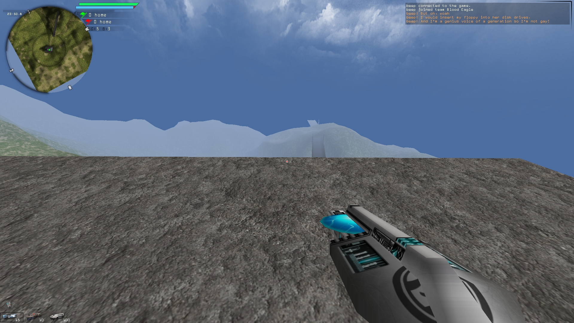
want to keep it simple but anything else i should add around the minimap? milk is making me new health/nrg bars for it so ignore those
health/nrg bars have a cool delayed red underlay effect kinda like mortal kombat styles
[config]input requested
Re: [config]input requested
also crow my bro - if i send you my latest version, wanna add definitions for the anni weapons to my scriptGL weaponhud? that would b p cool
Re: [config]input requested
I personally like to put my radar HUD in the lower right corner. This will cover part of your weapon, but you don't need to see what's there anyway. Then you can move your Health and Energy indicators to the upper left corner. This will leave your sky more open for spotting enemies.
Re: [config]input requested
Pros:
- Massive radar
- HD skins
- Weapon Hud
- Radar location
- Thin (difficult to see) huds (energy/health bars)
- Illegible font (when viewed from the distance I sit from my monitor...)
- Increase hud sizes (except radar, it's big enough)
- Increase font sizes (or buy me some reading glasses)
- Move radar to right side, possibly bottom (as stu suggested)
- Add custom sensor ping hud (possibly border color for radar hud, or dot color for crosshair)
- Make the flag hud more like the weapon hud but stretched across the top of the screen instead of the bottom, with actual team flag emblems (supporting up to 8 teams)
Re: [config]input requested
cool, thanks for the input guys - i too am used to the radar on the right hand side but i wanted room for the CTFHud stuff and it would probably get cut off if it was on the right
font can be changed globally to any .ttf font super easy, it's a $pref and affects all huds so don't worry about the font
gonna do some kind of animation with the hud so that when certain things aren't necessary they'll pop in/out
just some ideas
font can be changed globally to any .ttf font super easy, it's a $pref and affects all huds so don't worry about the font
gonna do some kind of animation with the hud so that when certain things aren't necessary they'll pop in/out
just some ideas
Re: [config]input requested
I also prefer the HUD on the top right. Fortunately there aren't any border images so you can move it wherever you want and it won't look out of place. At first glace it almost looked like it had a drop shadow, and I'm not entirely convinced there isn't one.
Re: [config]input requested
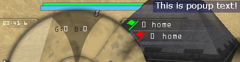
in this config its a .png overlay over the minimap but its smart (it follows where the minimap goes)Fixious wrote:I also prefer the HUD on the top right. Fortunately there aren't any border images so you can move it wherever you want and it won't look out of place. At first glace it almost looked like it had a drop shadow, and I'm not entirely convinced there isn't one.
it has a bit of a drop shadow and i'm using my .dll to set the minimap background underlay to white instead of black so thats why it might look strange
Re: [config]input requested
yea i could do this.Groove wrote:also crow my bro - if i send you my latest version, wanna add definitions for the anni weapons to my scriptGL weaponhud? that would b p cool
Re: [config]input requested
Is there a clock and date hud on there somewhere?
Re: [config]input requested
So, you put the radar on the left because you wanted to attach the flag hud to it?
Personally, I don't like it when two different huds are 'attached' to one another. It really limits your ability to move them around, which in this case, everyone will want to do since they are used to having the radar or compass on the right.
Also, I'm not a big fan of this:
The shading is on the side where I need more detail, so I can find those invisible fucks hiding in the hills. Also, why is the shading curved? Is it possible to shape it more like a pie chart, where the shaded area is behind you, and the missing wedge of pie dynamically matches your field of view?
Also, having your grenade/beacon hud on top of the radar in that gif is a big no-no. Don't do that. There's plenty of room around the radar for more huds, no need to pile them up on top of one another.